
Gatsby.js Tutorial Part Three
Gatsby lets you create “layout components”. Layout components are sections of your site that you want to share across multiple pages. For example, Gatsby sites will commonly have a layout component with a shared header and footer. Other common things to add to layouts are a sidebar and navigation menu.
On this page, the sidebar to the left (assuming you’re on a larger device) and the header at the top are part of gatsbyjs.org’s layout component.
Let’s dive in and explore Gatsby layouts.
First, create a new site for this part of the tutorial (and, as we mentioned in Part Two, at this point it’s probably a good idea to close the terminal window(s) and project files from previous parts of the tutorial, to keep things clean on your desktop). We’ll use the “hello world” starter again:
gatsby new tutorial-part-three https://github.com/gatsbyjs/gatsby-starter-hello-worldOnce the site is finished installing, install gatsby-plugin-typography. For a reminder of how to do this, see Part Two of the tutorials. For
the Typography.js theme, let’s try the “Fairy Gates” typography theme this time:
npm install --save gatsby-plugin-typography typography-theme-fairy-gatesCreate a src/utils directory, and then create the typography config file at src/utils/typography.js:
import Typography from "typography";
import fairyGateTheme from "typography-theme-fairy-gates";

const typography = new Typography(fairyGateTheme);

export default typography;
Then edit our site’s gatsby-config.js at the root of the site:
module.exports = {
  plugins: [
    {
      resolve: `gatsby-plugin-typography`,
      options: {
        pathToConfigModule: `src/utils/typography.js`,
      },
    },
  ],
};
Now, let’s add a few different pages: a front page, an about page, and a contact page.
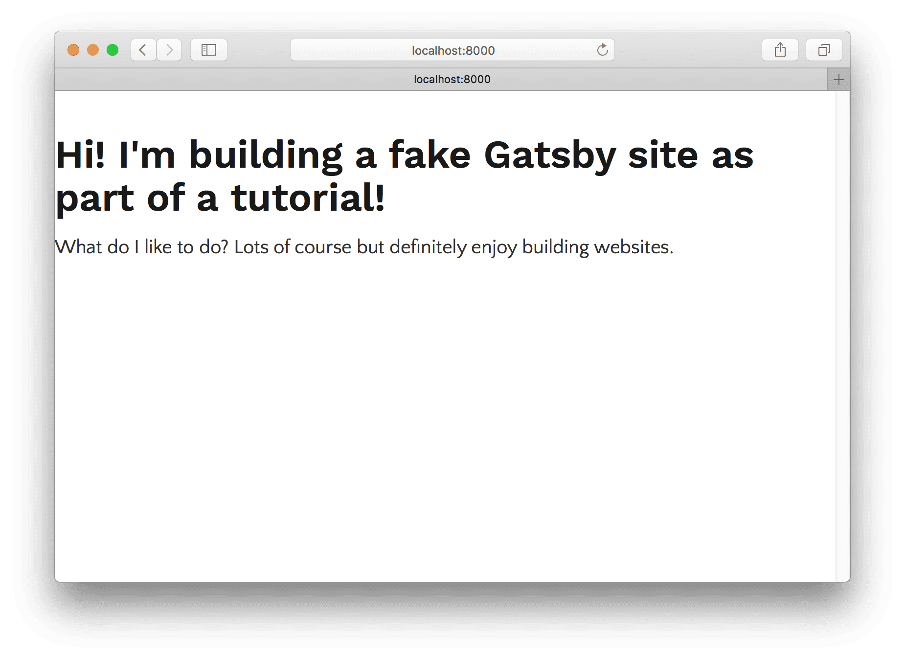
src/pages/index.js
import React from "react";

export default () => (
  <div>
    <h1>Hi! I'm building a fake Gatsby site as part of a tutorial!</h1>
    <p>
      What do I like to do? Lots of course but definitely enjoy building
      websites.
    </p>
  </div>
);
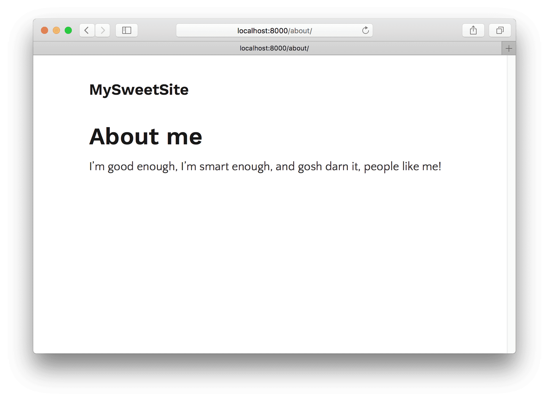
src/pages/about.js
import React from "react";

export default () => (
  <div>
    <h1>About me</h1>
    <p>I’m good enough, I’m smart enough, and gosh darn it, people like me!</p>
  </div>
);
src/pages/contact.js
import React from "react";

export default () => (
  <div>
    <h1>I'd love to talk! Email me at the address below</h1>
    <p>
      <a href="mailto:me@example.com">me@example.com</a>
    </p>
  </div>
);
We now have the start of a nice personal site!
But there are a few problems. First, it’d be nice if the page content was centered on the screen like in part two of the tutorial. And second, we should really have some sort of global navigation so it’s easy for visitors to find and visit each of the sub-pages.
Let’s tackle these problems by creating our first layout component.
Our first layout component
First, create a new directory at src/layouts. All layout components have to be
in this directory.
Let’s create a very basic layout component at src/layouts/index.js:
import React from "react";

export default ({ children }) => (
  <div style={{ margin: `0 auto`, maxWidth: 650, padding: `0 1rem` }}>
    {children()}
  </div>
);
Notice that unlike most children props, the children prop passed to layout
components is a function and needs to be executed
Stop gatsby develop and start it again for the new layout to take effect.

Sweet, the layout is working! Now, our text is centered and constrained to a column 650 pixels wide, as we specified.
Let’s now add our site title:
import React from "react";

export default ({ children }) =>
  <div style={{ margin: `0 auto`, maxWidth: 650, padding: `0 1rem` }}>
    <h3>MySweetSite</h3>
    {children()}
  </div>
If we go to any of our three pages we’ll see the same title added e.g. the
/about/ page:
Let’s add navigation links to each of our three pages:
import React from "react";
import Link from "gatsby-link";

const ListLink = props =>
  <li style={{ display: `inline-block`, marginRight: `1rem` }}>
    <Link to={props.to}>
      {props.children}
    </Link>
  </li>

export default ({ children }) =>
  <div style={{ margin: `0 auto`, maxWidth: 650, padding: `1.25rem 1rem` }}>
    <header style={{ marginBottom: `1.5rem` }}>
      <Link to="/" style={{ textShadow: `none`, backgroundImage: `none` }}>
        <h3 style={{ display: `inline` }}>MySweetSite</h3>
      </Link>
      <ul style={{ listStyle: `none`, float: `right` }}>
        <ListLink to="/">Home</ListLink>
        <ListLink to="/about/">About</ListLink>
        <ListLink to="/contact/">Contact</ListLink>
      </ul>
    </header>
    {children()}
  </div>
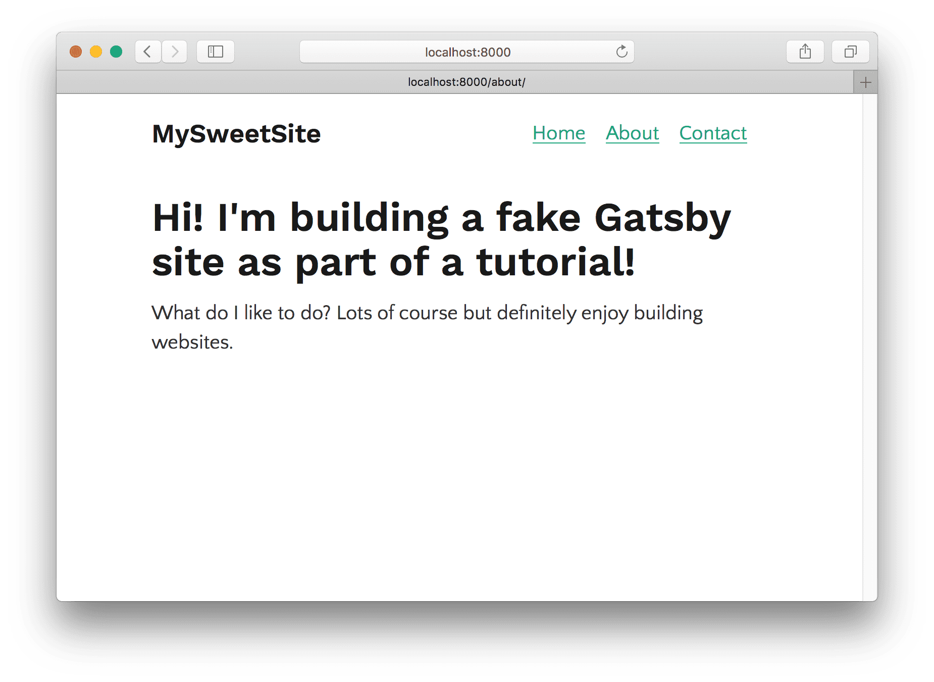
And there we have it! A three page site with a basic global navigation.
With your new “layout component” powers, you can add headers, footers, global navigation, sidebars, etc. to your Gatsby sites.
Continue on to part four of the tutorial where we’ll start learning about Gatsby’s data layer and programmatic pages!


